
Why consistency matters when your advert moves across towns
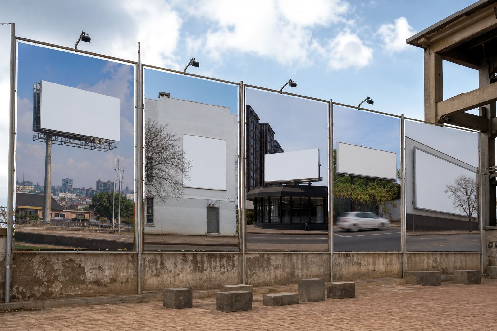
Multiple site advertising works best when every location feels like part of the same campaign, not a collection of separate adverts. A clean layout, matching colours and the same offer wording help people notice the brand faster, especially when they see one site in Johannesburg and another in Pretoria a few days later.
Outdoor space is read quickly. That means the core message must stay steady even if the panel size, wall shape or viewing distance changes. If one site uses bold headline text and another uses a crowded block of copy, the campaign starts to feel uneven and the impact drops off. Small differences are fine, but the main visual rules should stay the same from start to finish.
In South Africa, weather and site conditions also affect how a campaign ages. Coastal humidity in Durban can change the way certain finishes look over time, while strong sun in Gauteng can fade lighter colours if the material choice is poor. A consistent plan helps you control these practical details as well as the look of the advert.
Start with one master layout before you book the sites
The safest approach is to approve one master artwork first, then adapt it for each wall or billboard opening. That gives you one reference point for headlines, logos, legal lines and contact details. Once the base layout is settled, any size changes can be handled without rewriting the message every time.
For campaigns across Johannesburg, Sandton and Midrand, it helps to decide early how much space is needed for the main brand mark, the call to action and any required small print. A wall in Braamfontein may suit a vertical composition, while another site in Bloemfontein might need a wider format. The layout can shift, but the visual order should stay the same.
- Keep one master file with the approved logo placement and colour values.
- Use the same font family across all sites where possible.
- Hold the headline length steady, even if the supporting text changes slightly.
- Check that contact details, web addresses and legal lines appear in the same position on every version.
That way the campaign feels planned, not patched together at the last minute.
Match the message to the wall, not the other way round
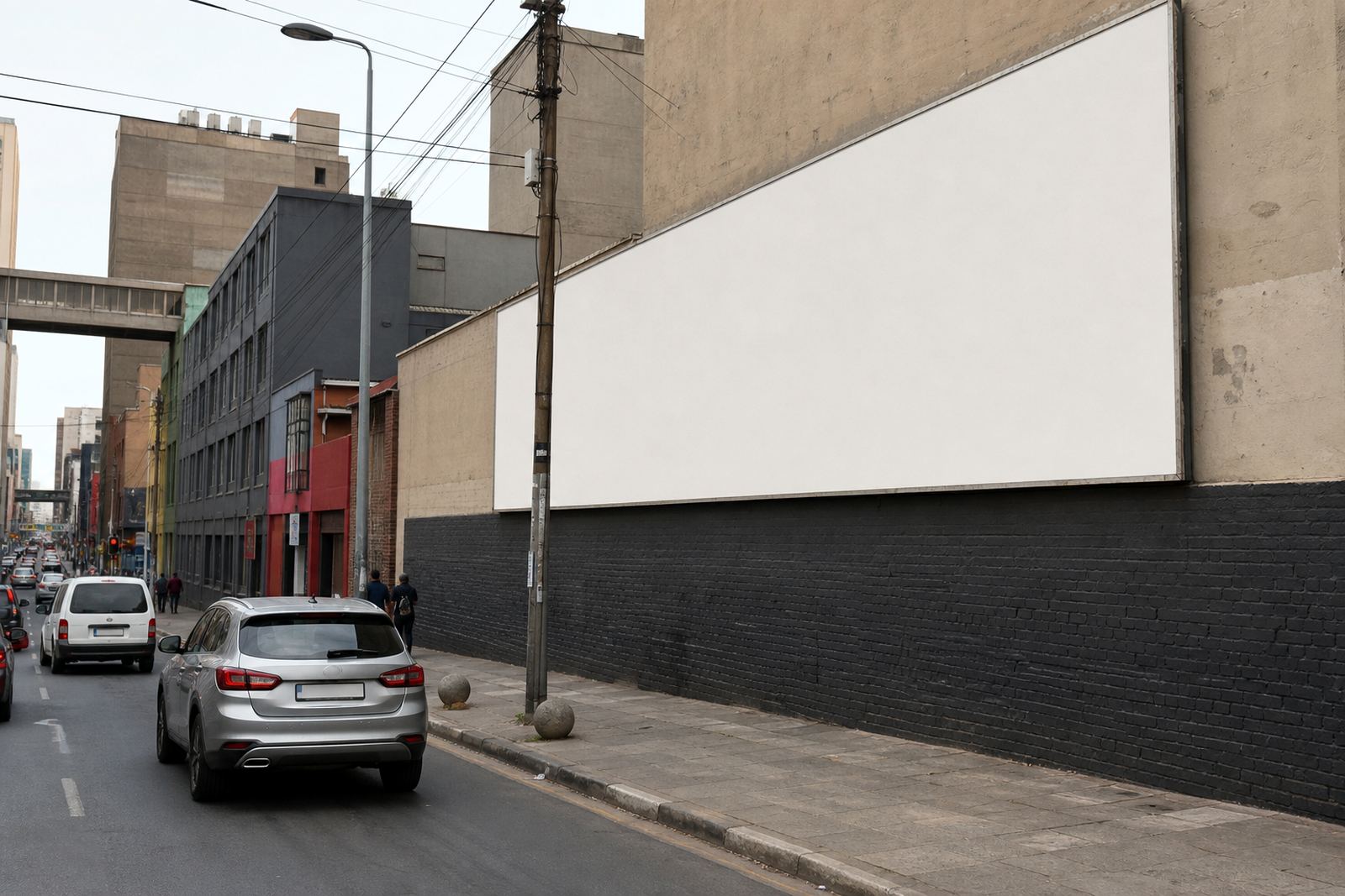
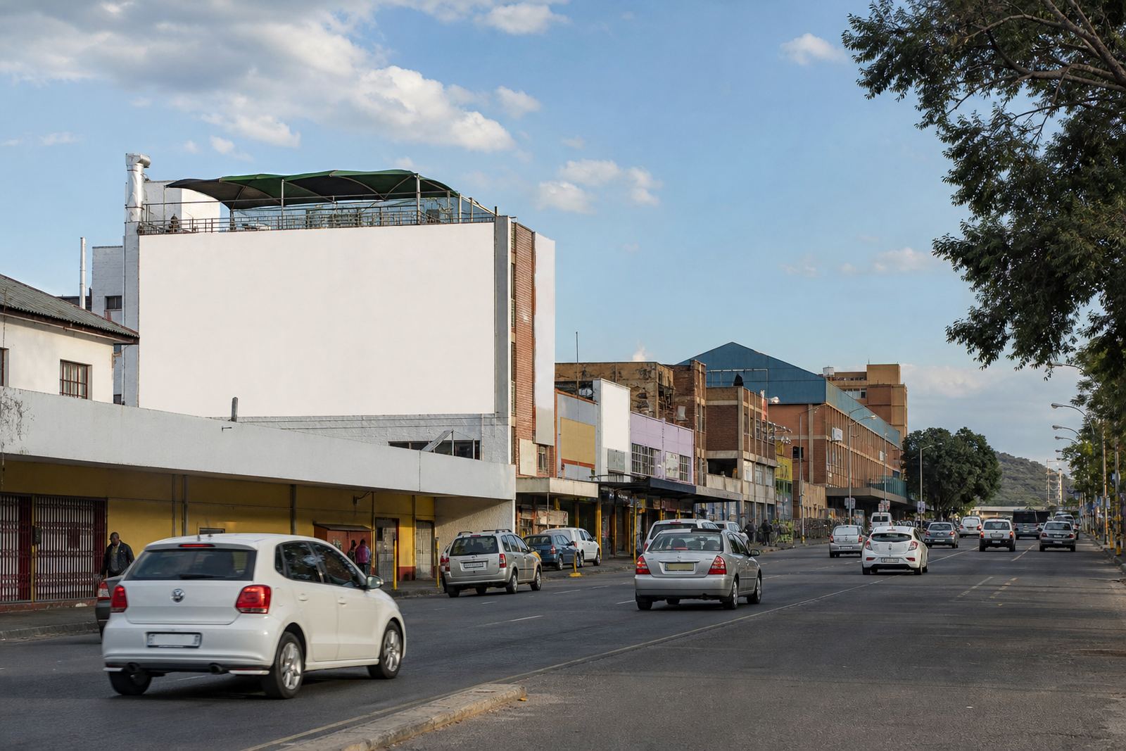
Not every wall is built the same way. Some sites have narrow edges, some sit high above passing traffic and some need stronger contrast because the viewing time is short. The trick is to preserve the same message while adjusting the artwork to suit each surface. You are not changing the campaign theme, just fitting it properly.
In practice, this means using one headline across all sites, then scaling secondary details to suit the available space. If one site cannot carry a long list of benefits, cut it back to a single clear promise and let the visual do the rest. The public should still be able to tell it is the same campaign the moment they see it.
- Use one hero image style or illustration style across all sites.
- Keep the same colour palette, including background tone and accent colour.
- Check viewing distance before setting text size.
- Adjust only what is needed for the wall shape, not the brand message.
This matters most when a campaign stretches across several cities, because even a small mismatch in tone can make the rollout feel uneven.
Consent, bylaws and property rules must be lined up early
Before any outdoor or wall signage goes up, the property owner's consent must be in place. The same goes for local municipal bylaw approval where it is required. Those steps are not a side issue, they shape the timing of the full rollout and can affect which sites are ready first.
If one site is approved and another is still waiting, the campaign team needs a clear holding plan so the materials stay consistent while the booking sequence changes. It is better to keep a unified artwork pack ready than to rush different versions for each location. Municipal rules can differ between Johannesburg, Cape Town, Durban and smaller centres like Bloemfontein, so the compliance checks should happen before the print run is locked.
For property owners, this also protects the site relationship. Everyone knows what is being displayed, for how long and under what conditions. That makes it easier to renew a listing later and avoid last-minute confusion about mounting, access or removal.
Keep listings, photos and booking notes aligned across the campaign
When a campaign uses several sites, the listing information has to be kept in step with the artwork plan. Site photos should show the correct angle, the visible surroundings and any practical details that affect installation. If a listing says the site faces a busy arterial road in Braamfontein, the creative team should know how that changes the reading distance and where the message needs to sit.
Clear notes also help with scheduling. If one wall needs a ladder setup and another needs access after business hours, the rollout order may change. The campaign should still feel consistent, so the install team, property owner and advertiser all need the same version of the brief. A missed note can lead to one site being fitted with an older proof, and that causes avoidable rework.
- Use one campaign brief for all sites, then add site-specific notes beneath it.
- Store the latest artwork version in one place only.
- Confirm installation windows before printing starts.
- Track which sites are live, pending, or awaiting final consent.
Good records save time and prevent small errors becoming expensive delays.
A Braamfontein rollout example that stays practical
Take a campaign based in Braamfontein that runs on several wall spaces across Johannesburg, Pretoria and Sandton. The advertiser wants one clear message, the same brand colours and a simple call to action across every site. One wall is long and low, another sits higher up on a building facade, and a third needs a tighter layout because of nearby structures.
The campaign can still feel uniform if the design rules stay fixed. The headline remains the same, the logo sits in the same corner, and the secondary copy uses the same weight and spacing. Only the proportions change. That makes the campaign recognisable even when the viewing angles differ and the surfaces are not identical. In a city like Johannesburg, where a person may pass the same brand in different suburbs during the week, that repeat recognition matters.
The final step is monitoring. Once the sites are live, check that each one still matches the approved version and that no panel has been affected by weather, dust or access issues. A quick review helps catch problems early, before one site drifts away from the rest.
What a consistent multi-site campaign should deliver
Consistency is not about making every wall look identical. It is about making every site feel like part of the same message, with no confusion in tone, spacing or finish. When that happens, the campaign looks planned, the property owners know where they stand and the advertiser gets a cleaner result across all locations.
For businesses using several outdoor spaces at once, the best approach is to keep the creative rules tight, the approvals clear and the rollout notes practical. That includes checking consent, confirming bylaw requirements and matching the artwork to each site without losing the original idea. Done well, the campaign holds together from the first wall to the last.
- One message, one visual standard, many locations.
- Adapt to the wall, but do not change the campaign voice.
- Keep approvals, artwork and installation notes in sync.
That is how a multi-site outdoor campaign stays clear, even when the locations are spread across different parts of South Africa.