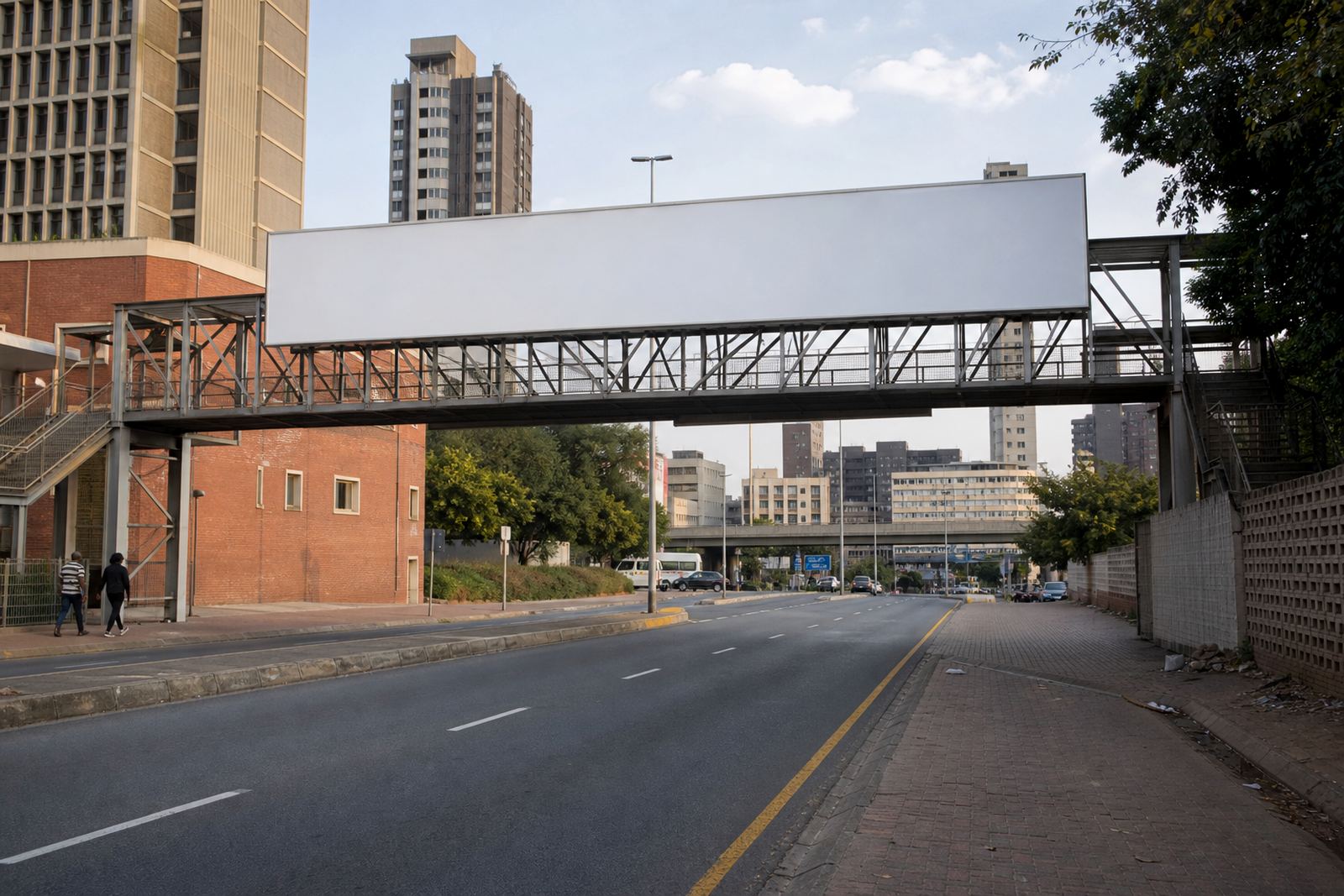


Start with the movement pattern, not just the map
When advertisers look for wall space or billboard space, the first question should not be “Where is the biggest road?” It should be “What kind of movement happens along this route?” A corridor used by daily commuters, shoppers, freight vehicles or weekend visitors each gives a different kind of exposure.
In practical terms, a slower route with frequent stops can suit a message that needs a longer read time. A faster arterial road may be better for a bold, simple message that can be seen in a few seconds. Side streets near business districts can work when the audience is already on foot or looking for nearby services. The point is to match the site to the behaviour of the people passing it.
In Johannesburg, for example, a placement in Braamfontein may suit a different purpose from one closer to Sandton or an outer residential route. The same applies in Pretoria, Cape Town, Durban and Bloemfontein. A corridor is not only about volume, it is about context, direction and whether the placement sits where people are likely to notice it.
Match the route type to your message length
Short messages work best where drivers and pedestrians only have a moment to look. Longer messages need slower movement or more repeat exposure. That is why route type matters so much when a business is deciding on outdoor advertising.
For some campaigns, a single strong product name or service line is enough. For others, the route has time for a clearer call to action, like a website address or a service area. If the placement sits near a stop street, taxi rank, shopping area or busy intersection, viewers may have a bit more time to take in the details. On a high-speed corridor, less is usually more.
- Fast moving routes suit simple, high-contrast artwork.
- Mixed traffic corridors can support slightly more detail.
- Pedestrian-heavy areas can handle messages that reward a second glance.
- Corner sites often benefit from clear orientation and large lettering.
It is also worth checking how the message looks in real weather and light. Coastal humidity in Durban can affect visibility if the artwork finish is poor, while strong sun in Gauteng can wash out weak colour choices. At night, nearby street lighting and passing headlights can change how the site reads from the road.
Think about the property around the route, not only the road itself
Route selection should include the property context. A wall facing a busy corridor is not automatically a strong advertising site. The surrounding buildings, angles, setbacks, trees, traffic islands and other structures all affect whether the message is easy to see.
It also matters who controls the surface. Outdoor signage needs the property owner’s consent, and the local municipal bylaw approval process must be followed where required. That can influence timing, artwork size, lighting and installation method. A site that looks ideal from the road may still need extra checks before a booking can move ahead.
In many cases, advertisers gain time by asking the right questions early. Is the wall structurally suitable? Is the view blocked at certain angles? Is there space for safe installation? Can the format be maintained without disrupting the property use? These details are small, but they often decide whether a corridor placement becomes a useful campaign or a headache later on.
- Check the wall face and angle from the main approach direction.
- Confirm the owner’s consent before booking.
- Allow time for municipal bylaw checks where needed.
- Look at maintenance access and installation safety.
Use a corridor mix instead of chasing one perfect site
Many advertisers want one site that does everything. In practice, a better approach is often a corridor mix. Different route types can serve different parts of the same campaign. One site may build first notice, another may support recall, and a third may help with local relevance.
This is especially useful for businesses that serve more than one area. A company trading across Johannesburg, Pretoria and Cape Town might need a mix of commuter routes, commercial streets and local access roads. A message aimed at nearby customers can sit in a different corridor from one meant for broader awareness. If the business needs branch visits, route choice should support that geography.
Here is a practical way to think about it:
- Main commuter corridors for broad everyday exposure.
- Business district streets for professional and weekday footfall.
- Retail access roads for service-driven or purchase-led messages.
- Neighbourhood routes for local trade and repeat visibility.
A corridor mix also helps when a site becomes unavailable or a campaign needs a refresh. If you have looked at route types properly, it is easier to shift the booking without losing the logic of the campaign.
A Braamfontein example: from inner-city flow to wider city reach
Take a business based in Braamfontein that wants to grow visibility across Johannesburg. A placement near the inner-city commuter flow can work well for awareness among people moving between offices, transport points and nearby districts. But if the service also targets higher-value commercial areas, a second site closer to Sandton may support a different stage of the message.
That does not mean one corridor is better than the other. It means each route serves a different purpose. Braamfontein can suit bold local visibility, especially where people are already on foot or moving slowly through traffic. Sandton may suit a cleaner, more polished presentation for business audiences. Midrand, Pretoria and other routes may support wider regional reach depending on the campaign goal.
The same logic applies in Cape Town, Durban and Bloemfontein. A central street is not the same as a ring road, and a shopping access road is not the same as a highway edge. Good selection starts with the route, then the format, then the artwork. When those three line up, the site has a much better chance of doing its job.
What to ask before you book a wall or billboard site
Before confirming an outdoor placement, advertisers should ask practical questions that save time later. These are the checks that help separate a good-looking listing from a site that genuinely fits the campaign brief.
- Which direction is the main traffic flow?
- How long is the site visible to people passing by?
- Is the message readable from the correct approach angle?
- Has the property owner given consent?
- What municipal bylaw approval is needed for this format?
- Will the artwork suit the light, weather and distance at the site?
For many advertisers, the route decision is also a budget decision. A site that fits the wrong corridor can waste time, even if the listing looked attractive online. Good corridor choice helps the campaign stay practical, especially when deadlines are tight and installation windows need to be planned around weather, access and property use. It also makes renewals easier because the same logic can be used again when a campaign is extended.
At RentThisWall, the focus is on helping advertisers compare route types, match sites to campaign intent and keep the booking process orderly. When the corridor is chosen well from the start, the rest of the work becomes much easier to manage.