
Start With How People See The Space
Outdoor advertising is read in motion, often from a moving car, taxi rank, or pedestrian route. That means the site controls the message as much as the copy does. A wall facing slow foot traffic can carry more detail, while a high mounted board on a busy arterial road needs fewer words and stronger contrast.
Before you brief artwork, think about where the viewer will be, how long they have to read, and what angle they will see first. A narrow street in Braamfontein asks for different treatment than a broad suburban road in Sandton. The same idea can work in both places, but the wording, font size and image choice should change to suit the space.
- Short viewing time calls for one clear message
- Longer viewing time allows a fuller offer or service line
- Busy backgrounds need higher contrast and simpler layout
- Corner sites may need copy that reads from more than one direction
Match Message Length To The Viewing Distance
A wall with close pedestrian traffic can carry more detail than a large format sign viewed from farther away. If people pass within a few metres, they can take in a headline, supporting line and contact cue. If the site is seen from a vehicle, the message needs to be almost instant.
Keep in mind the scale of the surface too. A long wall gives room for a stronger visual rhythm, while a tall narrow section may suit one bold image with a short line underneath. In Durban, for example, coastal moisture and bright sun can affect how colours read through the day, so a simple layout with strong type usually holds up better than a crowded design.
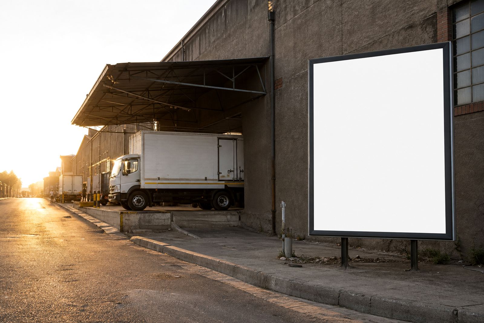
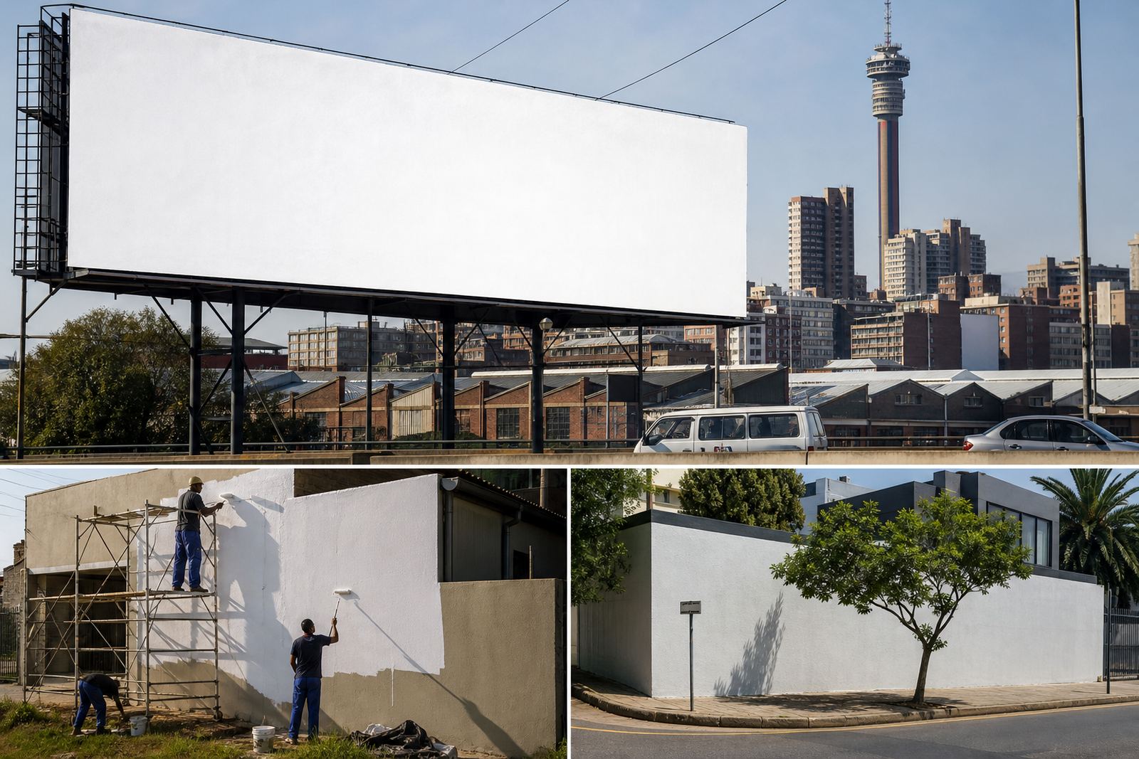
- Large roadside boards: one key idea, one call to action
- Wall wraps near walkways: more room for brand detail and supporting copy
- Sites near traffic lights: people may stop briefly, so slightly more text can work
- Sites near fast traffic: keep the message tight and easy to grasp at a glance
Choose The Tone That Fits The Neighbourhood
The same business can speak differently in different parts of the country. A youth-focused campaign on a central Johannesburg wall may use bolder language and a sharper visual style than a professional services message near a business district in Pretoria. The trick is not to change the truth of the offer, only the way it is framed.
Local context matters. Around student and mixed-use areas, people respond well to direct, energetic wording. In more formal business areas, a calmer tone with clear facts can feel more credible. If the site is in Bloemfontein or on the outskirts of Cape Town, think about the local pace of movement, the surrounding buildings, and what your audience already sees on that route every day.
When you match the tone to the place, the message feels like it belongs there instead of shouting at the street.
Use The Wall Or Board Shape To Guide The Creative
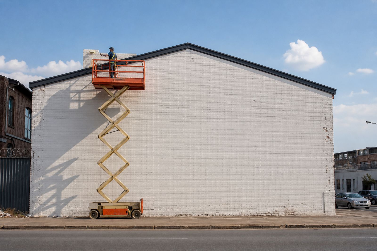
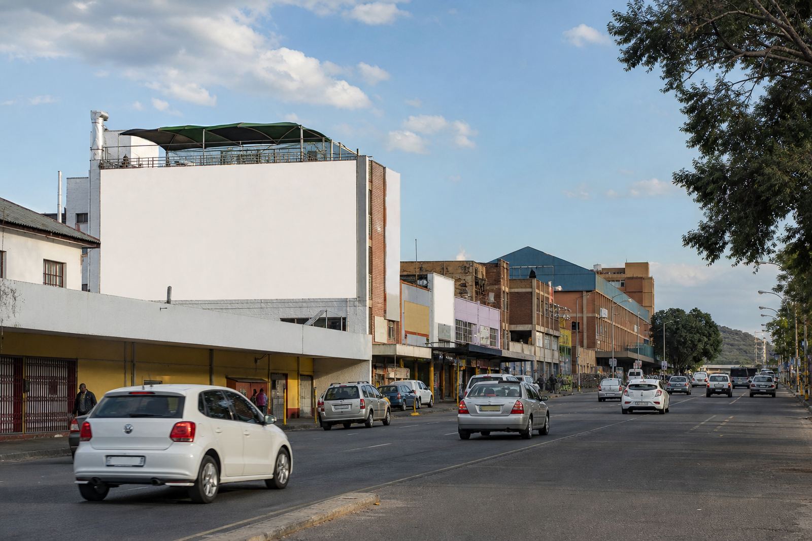
Not every site is a perfect rectangle and that matters more than many advertisers expect. A long horizontal wall can support a wide visual story, while a vertical panel may need a centred headline and a single strong image. If the surface has windows, ridges, pipes, or uneven paint, the artwork should work with those details instead of fighting them.
Our team often sees better results when the creative is shaped around the space from the start. That means checking the photo, measuring the usable area, and confirming where text will sit before production begins. It also means avoiding tiny logos or fine print that may disappear once the piece is installed.
- Wide walls: use horizontal flow and fewer line breaks
- Tall surfaces: keep the headline stacked and easy to scan
- Textured walls: use heavier type and simpler colour blocks
- Sites with obstructions: place the main message where it stays visible
Make Compliance Part Of The Message Planning
Every outdoor sign needs the property owner's consent and local municipal bylaw approval. That is not just a box to tick, it affects what can be installed, where it can sit, and how long the campaign can remain in place. If a site is near a road reserve, a heritage area, or a building with shared ownership, the practical process can take a bit longer.
It helps to plan the message with approvals in mind. A clean, tidy layout is easier to sign off than a design that overreaches the available space. Artwork specs should be checked early, especially where size limits, fixing methods, or lighting rules may apply. In some parts of Johannesburg and Pretoria, the property owner, tenant, and municipal process all need to line up before installation can be scheduled.
For advertisers, that means fewer surprises and a better fit between the creative and the site.
A Braamfontein Example: When The Route Shapes The Message
Take a wall-space campaign in Braamfontein. The area has a mix of students, office workers, commuters and street-level foot traffic, so a message there often needs to work in layers. A headline should be readable fast, but the visual can still carry some personality because people may pass the site more than once in a week.
If the space is facing a busy walking route near shops or transport links, the best approach is usually a short, direct line with one strong visual anchor. If it is set slightly back from the pavement, you may have room for a second line that gives more context. The point is to match the message to the path people take past the site, not just to the brand itself.
This is where good listing detail helps. Site photos, measurement notes, availability updates and consent guidance all make it easier to choose a space that suits the campaign rather than forcing the campaign to fit the space.
Use The Right Support To Keep The Match Tight
A good campaign is not only about finding a space, it is about keeping the right site, the right message and the right timing aligned. That is why listing copy, brief matching, booking coordination and installation scheduling all matter. When the details are clear from the start, advertisers can choose sites that suit their message instead of guessing after the fact.
Property owners also benefit when the listing reflects the real shape and condition of the space. A clear description of access, visibility, surface condition and renewal options makes it easier to attract the right advertiser. For campaigns that run through summer heat, winter rain or coastal humidity, it is worth checking materials and fixing methods before final approval. A well matched site does not need to shout, it just needs to fit.
- Set the message before you choose the site
- Check viewing distance and angle before final artwork
- Confirm property owner consent and municipal bylaw approval early
- Use accurate photos and measurements to avoid rework
- Allow enough time for booking, production and installation