
Start With the Viewing Distance, Not the Detail
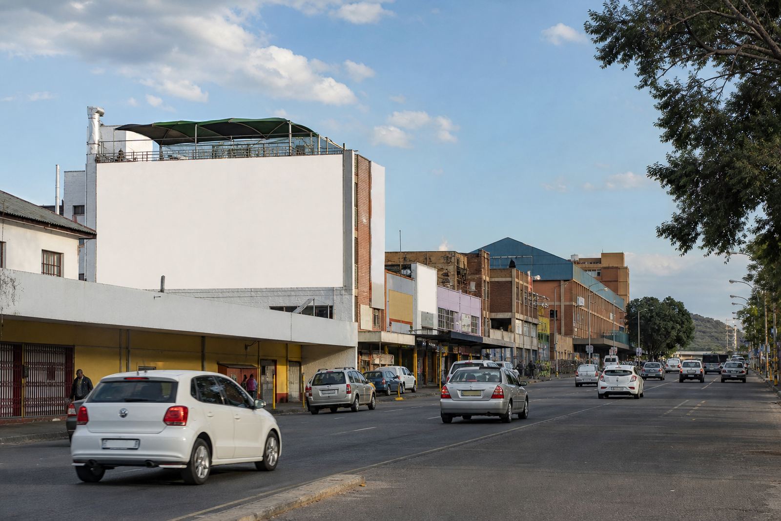
Large format artwork works best when you decide how far away people will see it before you start placing text and images. A wall on Jan Smuts Avenue in Braamfontein is read differently from a quieter street in a residential pocket of Pretoria or a roadside wall in Bloemfontein. The further the viewer, the less fine detail will help. Keep the main message clear, and make the brand name or call to action easy to recognise at a glance.
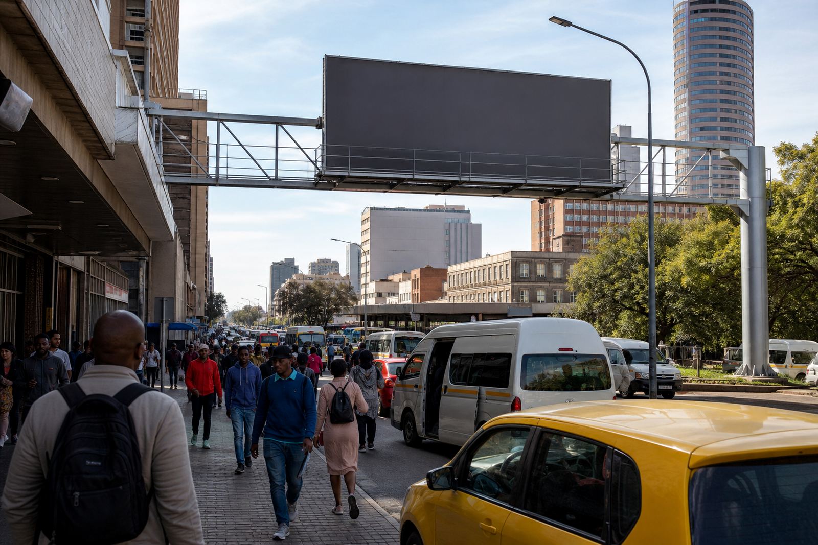
If people will see the ad from moving cars, minibus taxis or foot traffic, choose short lines and one strong visual point. Long sentences, small copy and busy layouts tend to disappear on a large surface. That does not mean the artwork should be empty, only that every element needs a purpose.
- Use one headline or short message rather than several competing lines.
- Place the most important detail near the centre of the design.
- Avoid thin typefaces that can break up when enlarged.
- Check the design from a distance before approving print.
Build for the Wall Surface and the Weather
Not every wall is the same. A painted brick wall, a metal frame and a smooth cladding panel all behave differently, especially in places with strong sun, coastal humidity or dust. In Durban, for example, moisture in the air can affect how materials sit over time, while in inland areas the dry heat and afternoon wind can put pressure on edges and fixings. Your artwork should suit the actual surface, not only the screen where it was designed.
Leave enough safe area around the edges so important text does not get lost in trimming or fastening points. If the installation will stay up for months, ask for artwork that can cope with fading risk, glare and weather movement. A good spec sheet helps the printer and installer work to the same measurement and keeps surprises out of the process.
- Ask for the exact wall measurements before final artwork is set.
- Keep logos and text away from edges, joints and lighting fixtures.
- Use colours that stay strong in full sun, not only on a bright monitor.
- Plan for rain, dust and coastal moisture if the site is exposed.
Keep the Message Short and Legible
Outdoor advertising is not the place for long explanations. If someone has three seconds to look up from traffic on a Johannesburg arterial road, the artwork must do the job fast. A short headline, one supporting line and a clear action often perform better than a crowded layout with several points. That applies whether the space is on a building in Sandton, a wall near Midrand or a roadside site in Cape Town.
Use strong contrast between text and background. Dark text on a pale background, or pale text on a dark block, usually reads better than soft tonal combinations. Keep the type large enough to remain visible when scaled. It is worth checking spelling, spacing and line breaks carefully because a tiny error can become very noticeable once the artwork is installed. A missing letter or awkward break can make the whole piece feel careless.
- Use plain language that people understand quickly.
- Do not overload the design with contact details and long claims.
- Choose a font that stays clear when enlarged to full size.
- Test the line length so words do not bunch up or wrap badly.
Match the Artwork to the Site and the Audience Flow
Good large format preparation starts with the actual location. A wall facing a busy intersection needs a different approach from one beside a pedestrian route or near a shopping node. In Braamfontein, for instance, a campaign close to student movement and office foot traffic may need a sharper, more immediate message than a quieter suburban wall. The artwork should fit the pace of the street, the height of the installation and the angle at which people will see it.
Ask for site photos if they are available and study them carefully. Look at nearby trees, poles, light fittings and building lines that might interrupt the view. Consider whether the space will be seen in daylight only or also after dark. If the wall is near an area with load-shedding, poor lighting or reflective surfaces, the artwork may need stronger contrast to stay readable in low light.
- Check where the viewer stands or drives when first seeing the site.
- Notice anything that may block part of the image during installation.
- Adjust contrast if the wall sits in shade for much of the day.
- Keep the message simple enough to read quickly at the site speed.
Prepare Files Properly Before Print
File setup matters as much as the design itself. A large wall graphic that looks fine on a laptop can still print poorly if the file is too small or the images are not sharp enough. Use the correct dimensions, allow for bleed where needed and make sure any photographs or artwork elements are high enough quality for enlargement. If there is a logo, use the best version available so the edges stay clean.
It also helps to separate the artwork review from the marketing message. First check the technical side, then check the wording, then check the visual balance. That order reduces the chance of last-minute changes and helps the installer work from a file that is ready for production. The more complex the wall, the more useful that step becomes.
- Set the artwork to the correct size from the start.
- Use high resolution images that will not blur when enlarged.
- Keep a copy with editable text in case small changes are needed.
- Confirm all spellings, dates and legal lines before print release.
Do Not Forget Consent, Bylaws and Installation Timing
Even the strongest artwork needs the right approvals. Signage on a rented billboard or wall space must have the property owner’s consent, and the local municipal bylaw approval process still applies. That means the creative plan should be checked alongside the compliance steps, not after the artwork is already finalised. It saves time and avoids confusion when the site owner or municipality asks for changes.
Installation timing also matters. If the wall is in an area with busy traffic, access restrictions or weather shifts, the schedule should account for that. A clean plan for delivery, mounting and final checks helps the work go up properly and stay in place. In practice, the best campaigns are the ones where artwork, consent and logistics move together from the beginning.
For advertisers, this is where clear coordination makes a real difference. A site in Bloemfontein may have one set of access conditions, while a central Johannesburg wall may need tighter timing and more careful on-site planning. Keeping the artwork ready early gives everyone more room to handle the local process properly.