
Start With the Route, Not the Artwork
Before you talk about size, colour or copy length, map the actual movement pattern you want to reach. In Johannesburg that might mean morning traffic into Braamfontein, Sandton or the inner city, while in Pretoria it could be a commuter line that shifts between residential suburbs and office nodes. The point is to look at where people are already moving, pausing or waiting, then place the site where the message has a fair chance of being noticed.
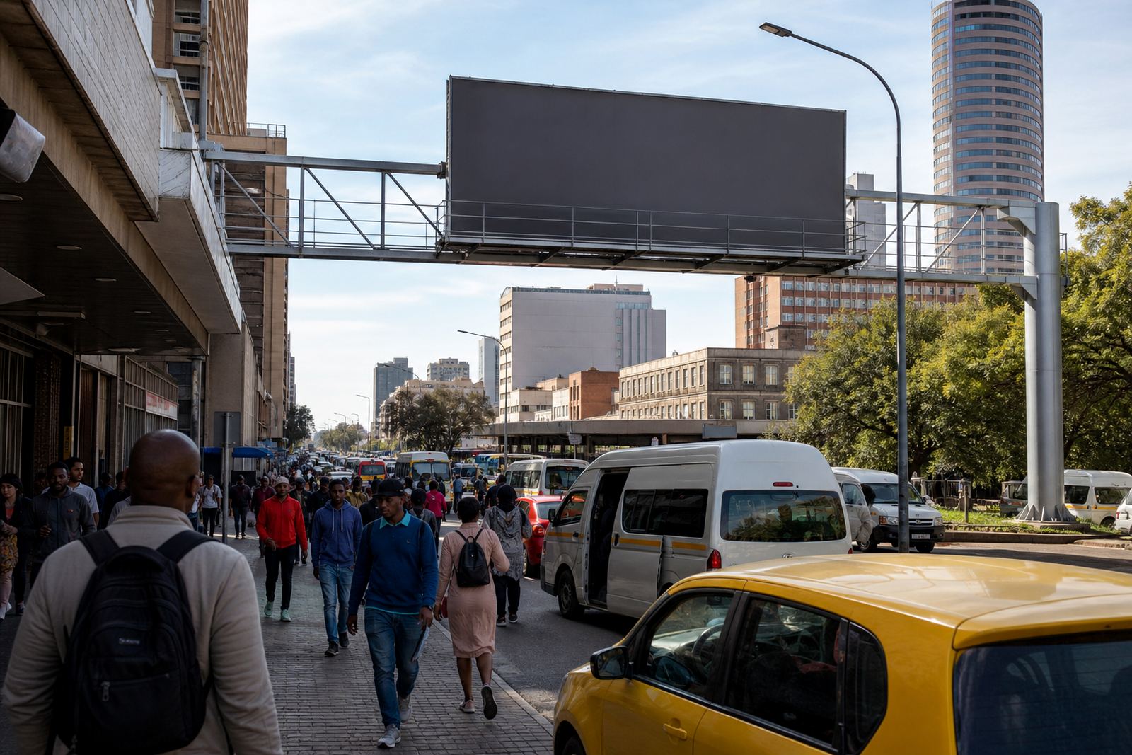
For wall advertising and billboard space, route planning is not only about vehicle flow. It also includes bus stops, taxi ranks, pedestrian crossings, station approaches and retail edges where people slow down. A good site often works because it is seen many times, not because it is the biggest panel on the street.
Match the Site to the Daily Rhythm
Morning movement, lunchtime movement and the trip home all create different viewing conditions. A commuter facing traffic at 7am may only have a few seconds to take in a message, so the copy needs to be clear and the layout simple. Later in the day, a slower route near a shopping strip or a feeder road can allow a little more detail, though the message should still be direct.
In coastal cities like Durban and Cape Town, weather also plays a part. Sea air, mist and winter rain can affect visibility and the condition of exterior surfaces, so the site choice should take durability and maintenance into account as well. In humid areas, it helps to keep checking how the surface and fixing points are holding up, specially after heavy weather.
- Choose high-visibility points on the route, not hidden side walls
- Allow for stop-start movement near intersections and taxi activity
- Use simpler copy where people only have a few seconds to read
- Check how light, shade and weather affect the view at different times
Think in Nodes, Not Just Streets
A commuter route is usually built around nodes: train stations, taxi interchanges, university edges, business districts, shopping corridors and residential feeders. In Braamfontein, for example, movement changes quickly between student traffic, office travel and inner-city footfall. A wall facing a node can work better than one on a faster road because people naturally slow down, turn, queue or wait.
This is where brief matching matters. If your message supports repeat exposure, route planning can prioritise consistency. If it needs quick response, the site should sit close to a decision point such as a turn-off, junction or entrance. You do not need to force every site into the same job, and that is where many campaigns go wrong.
Check Consent, Bylaws and Practical Access Before Booking
Any signage needs the property owner’s consent and local municipal bylaw approval. That is not something to sort out at the end, because route planning can change once a site is checked against access, permission and compliance requirements. A wall may look ideal from the road but still be unsuitable if the owner has restrictions, the municipality requires extra steps or the installation access is too tight.
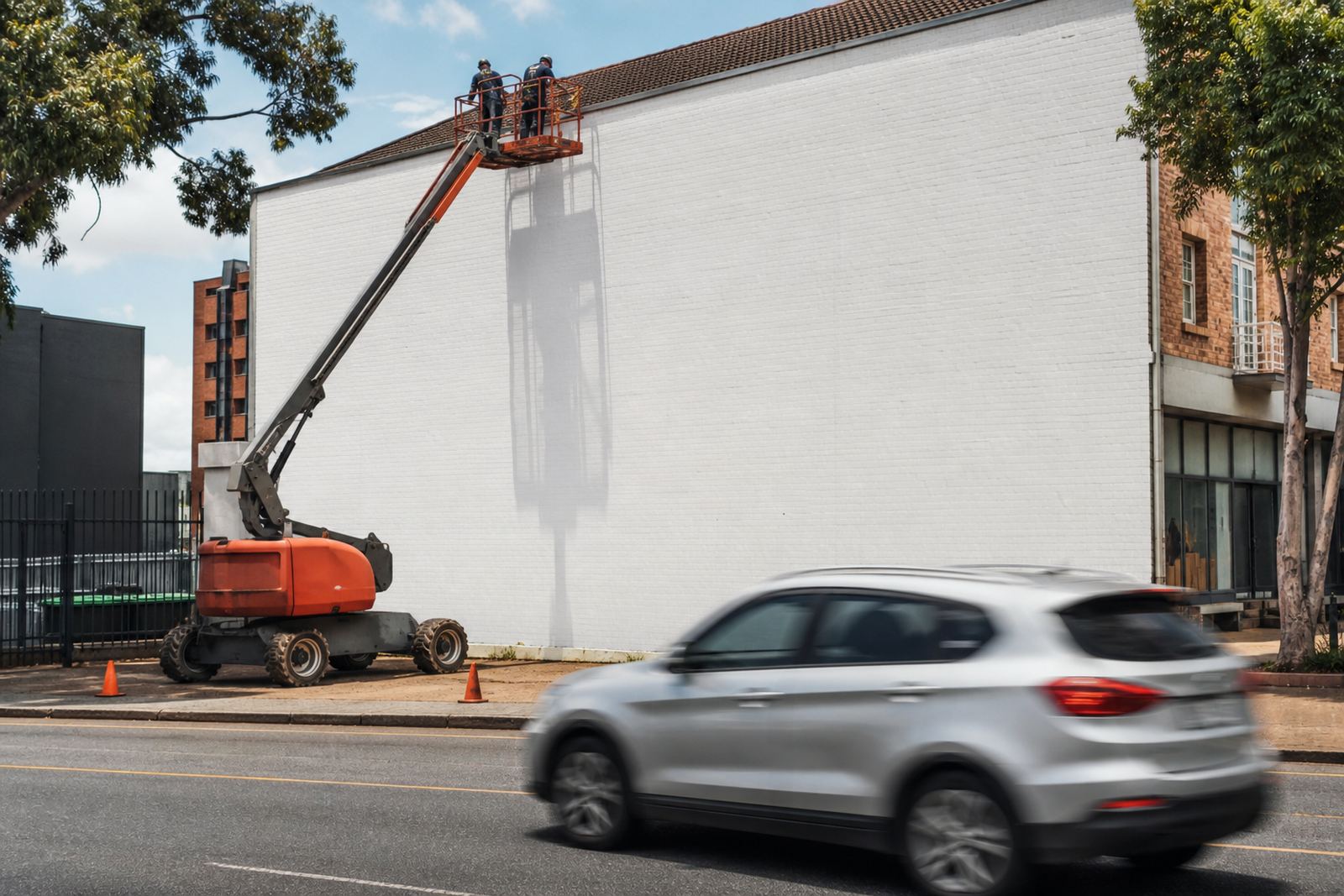
It also helps to think about how the team will actually get to the site. Narrow lanes, parking limits, overhead cables and working hours can all affect installation scheduling. In some areas, particularly around busy commercial centres, the best route for the audience is not always the easiest route for the crew, so a proper check saves time later on.
- Confirm the property owner’s written consent
- Check the local municipal bylaw position early
- Review access for installers, lifts and fixings
- Plan for service windows that do not disrupt nearby businesses
Use Photo Curation and Specification Checks to Avoid Surprises
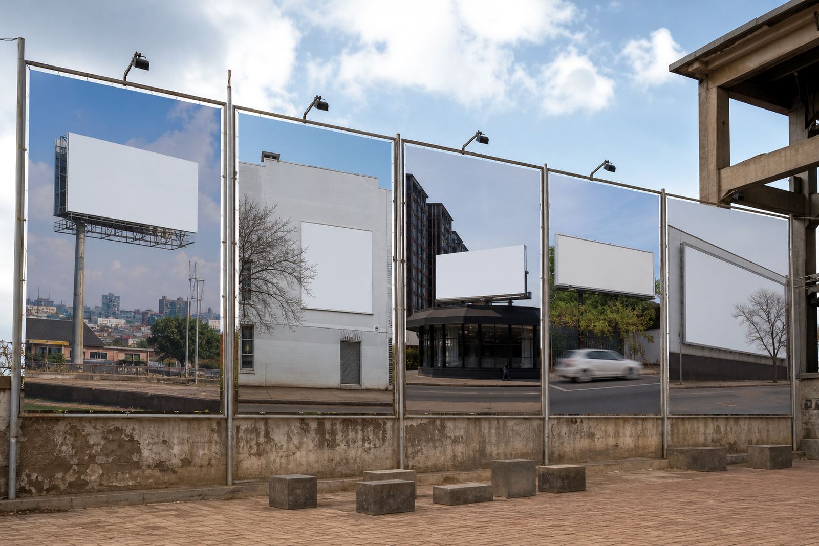
Good route planning depends on clear site photos and accurate listing notes. A photo taken from the wrong angle can make a wall look more visible than it really is, or hide poles, trees, road bends and nearby clutter. That is why site photo curation and listing copywriting matter just as much as the route itself. You want to know exactly what a commuter will see from the road, from the pavement and from the turning lane.
Artwork spec checks are part of the same job. If the format does not suit the site, the message may lose impact even on a strong route. For walls in exposed areas, check sizing, fixing points and the surface condition before anything is signed off. A little attention here avoids wasted production and keeps the campaign grounded in what the site can really handle.
A Braamfontein Example: Small Changes, Better Flow
Take a local example around Braamfontein. A business looking to reach city commuters might be tempted by a site simply because it is central, but the smarter move is to test how people approach it during the day. Does the road slow at a robot, a turn or a crossing? Is the wall visible to both bus and taxi movement? Is there enough spacing for the message to be read without strain? Those details matter more than a flashy pitch.
From there, the booking process becomes more practical. Availability management confirms whether the site is open for the right period, booking coordination keeps the parties aligned, and campaign monitoring checks whether the space is doing what was expected. If the route changes due to roadworks, load shedding around nearby lighting, or a shift in commuter patterns, renewal support and simple adjustments can keep the campaign useful instead of stale.
- Use one clear route objective per site
- Keep the message readable from the likely viewing distance
- Match the site to the time of day people pass it
- Review performance during the booking period, not after it ends
At RentThisWall, the focus is on helping property owners and advertisers work through the practical steps, from consent check guidance to bylaw process support. That way the route plan is not just a map exercise, it becomes a workable outdoor setup that fits the street, the schedule and the site conditions.