
Why Short Copy Works Better on Busy Roads
People do not stop to study a wall ad while walking past a taxi rank or sitting in traffic on Jan Smuts Avenue. They glance, take in a shape, a colour, maybe one line of text, and move on. That is why outdoor advertising works best when the message is stripped back to the basics.
A simple ad gives the eye one route to follow. If the layout tries to say too much, the main point gets lost. Keep the offer, the name and the call to action in front of the viewer, then leave the rest out. In places like Braamfontein and Sandton where people are moving fast, that clarity matters even more.
- Use one message, not three.
- Choose a large typeface with good spacing.
- Keep the visual focus on one product, one service or one action.
- Avoid tiny text that people cannot read from the street.
What Happens When You Crowd the Layout
Many advertisers want to fit in every detail at once. They add a slogan, a phone number, a list of services, a website link and a long explanation. The result is usually too busy for outdoor use. If a driver or pedestrian has to work hard to understand the ad, the message has already slipped away.
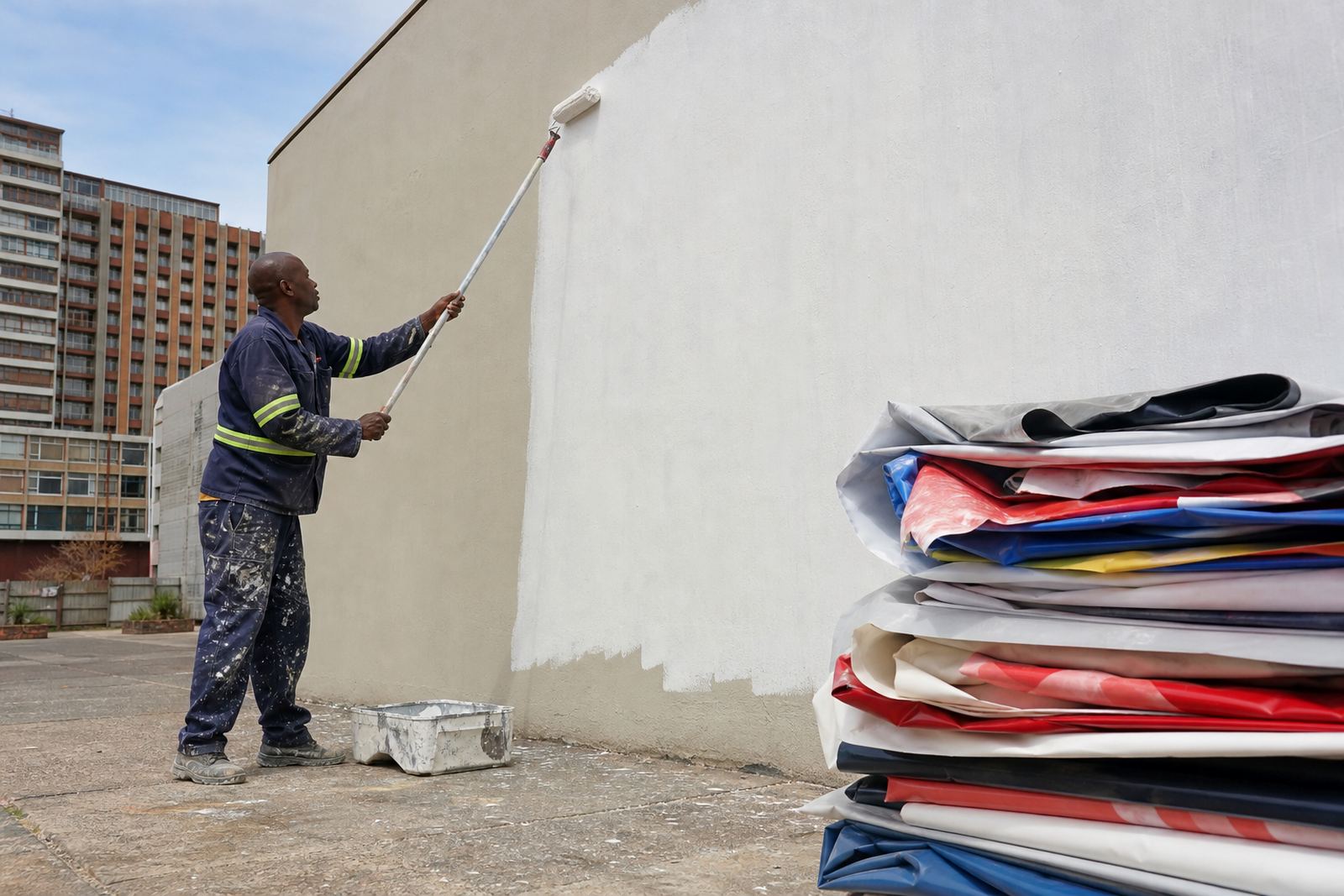
A crowded design can also look untidy against the building itself. Wall advertising sits inside the real world. It shares space with trees, poles, windows, cables and changing light. A cleaner layout holds its own better, especially on large surfaces in Johannesburg where there may be harsh sun in the day and glare at dusk.
- Too much text makes reading slow.
- Too many colours can weaken the main brand colour.
- Too many images can confuse the eye.
- Too many details can make the ad look smaller than it really is.
A Practical Formula for Better Wall Messaging
A useful rule for outdoor copy is simple enough to remember: say what it is, say why it matters, then say what to do next. That structure keeps the ad direct without sounding empty. It also helps when the space is not huge and the viewer is only passing once.
For example, a cleaner layout may use a bold headline, a short support line and one action line. The wording should work from a distance and still make sense if someone sees it for only two or three seconds. On a wall space in Braamfontein, that might mean a clear headline about a service area, followed by a short line about availability and a simple instruction to enquire.
- Headline: the main idea.
- Support line: the useful detail.
- Action line: what the viewer should do next.
That approach keeps the design neat and practical, while giving the advertiser enough room to breathe. It also leaves space for the property face itself which is often half the appeal of the site.
Design for the Street, Not the Boardroom
What looks polished in a meeting room may not read well outdoors. Screens are close, bright and controlled. Streets are not. Outdoor messages need to be judged in real conditions, with sunlight, moving cars, uneven angles and sometimes load-shedding conditions where nearby lighting may be limited. A good layout still reads clearly at different times of day, and that matters on street-facing walls or roadside billboards.
The best designs are usually the ones that make fewer demands on the viewer. They do not ask people to pause and decode them. They give one strong idea and let the site do part of the work. That is why a short line on a clean background often outperforms a crowded design with lots of detail.
- Test the design from a distance before sign-off.
- Check that contrast still holds in bright sun.
- Keep fonts bold enough for quick reading.
- Leave space around the text so it does not feel squeezed.
Braamfontein Example: Clearer Beats Busier
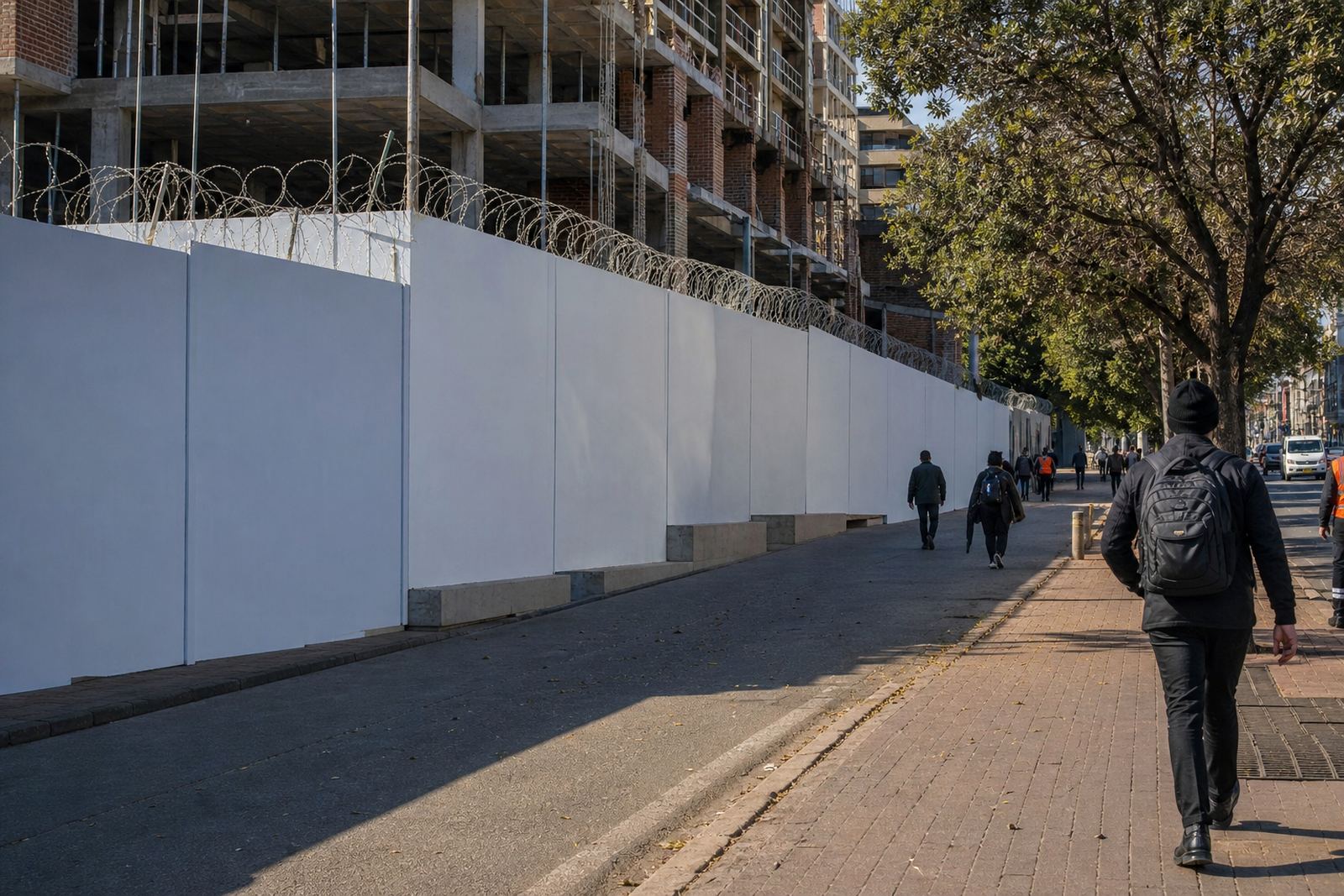
Take a wall site in Braamfontein where students, office workers and taxi commuters pass through during the day. A busy layout with small print and several messages can disappear into the noise of the area. A simpler design, by contrast, can stand out without shouting. One strong image, one short headline and one clear action often work better than a page full of copy.
That same thinking applies in Pretoria, Durban, Cape Town or Bloemfontein. Different roads, different building fronts, same basic rule: if the message can be understood quickly, it has a better chance of being remembered. Outdoor advertising is not the place for long explanations. It is the place for sharp, practical wording that can be read in a glance.
Good outdoor planning also depends on the site itself. Consent from the property owner is required, and the relevant municipal bylaw approval process must be followed before display. That is part of keeping the work in order, especially when the site is exposed to public view and local enforcement can vary from one area to the next.
Simple Does Not Mean Plain
Keeping design simple does not mean it has to look dull. It means every part of the layout earns its place. A single image can be striking if it is chosen carefully. A short headline can carry weight if the wording is direct. Colour can still be used well, as long as it supports the message instead of competing with it.
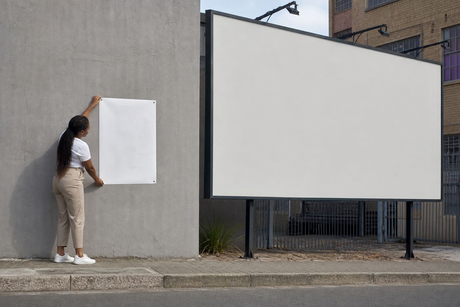
The strongest outdoor work often has a quiet confidence. It knows what it wants to say and avoids over-explaining. That is useful for advertisers who rent wall space or billboard space across South Africa, because the space itself is already doing a lot of work. A clean design lets the location remain visible while the message stays easy to follow.
- Use fewer words and stronger wording.
- Make sure the visual matches the message.
- Keep the layout tidy across different site sizes.
- Leave enough margin so the ad does not feel cramped.
When the design is simple, the booking process becomes easier too. Artwork checks are quicker, installation runs smoother, and any needed changes are easier to manage before the campaign goes live.