
Start With The Viewer's Actual Position
When people talk about outdoor advertising, they often start with the location first. That matters, but the first practical question is this: where will the viewer be standing or moving, and how long will they have to see the message? A wall beside a busy street in Braamfontein works differently from a freestanding board near a slower local road in Sandton or a property boundary in Durban where drivers may only glance once.
Viewing distance is not only about how far away the sign is. It is also about speed, angle, height, and whether the message is seen by a pedestrian, a driver, or someone in a taxi queue. A wall wrap viewed from 20 metres needs a different layout from a panel that must be read from much further back. If the message is too small or too busy, it will be missed long before the viewer gets close enough.
One simple rule helps: the further the viewing point, the fewer words you should use. That is why short copy, large lettering, and strong contrast usually perform better than long sentences or thin fonts. It is not about making the sign plain. It is about making it readable in real conditions, including glare, rain, dust, and the stop-start movement of traffic.
Match Letter Size To Reading Distance
Letter size should be chosen for the distance at which the message must be understood, not just noticed. If the wording is too small, the eye may catch the colour or shape but miss the message. That is a common mistake on wall advertising where a business tries to fit too much into one panel.
A practical way to think about it is to scale the message by distance bands. Short viewing distances allow a little more copy. Longer viewing distances call for bolder type and simpler structure. In busy Johannesburg streets, especially where drivers are moving and changing lanes, the sign has to do its job quickly. In a slower setting, such as a pedestrian route near offices or student housing, the reader may have a little more time.
- Use larger lettering for the main message and keep secondary text smaller.
- Choose clear fonts with enough spacing between letters.
- Avoid thin lines that disappear at a distance or in bright sunlight.
- Keep key words in the top or centre part of the layout where the eye lands first.
Printing and fabrication also matter. Small detail can blur when viewed from far away, especially on a wall surface with texture. A clean, simple design usually survives real-world conditions better than a busy one.
Layout Should Help The Eye Move Fast
Legibility is not only about size. It is about the order in which the eye reads the message. Good outdoor layouts guide the viewer from the main name or offer to the supporting detail without forcing them to search for it. If the board asks too much of the viewer, it loses impact.
Think of the sign as a short conversation. The first job is to catch attention, the second is to make the point, and the third is to leave the viewer with enough information to remember it. That is why wall and billboard layouts usually work best when they are built around one clear idea. A logo, a short line, and a contact route can be enough if the viewing distance is right.
Spacing matters too. Letters that are crowded together can merge at a distance, while too much empty space can weaken the message. The balance changes depending on where the sign is mounted. A high wall in Cape Town with strong natural light may need more contrast. A roadside panel in Pretoria may need stronger wording because the viewer has very little time to take it in.
- Use one main point only, unless the viewing distance is short.
- Separate the headline from the supporting detail with clear spacing.
- Place the most important word where the viewer's eye starts.
- Use contrast that still works in shade, sunlight and evening light.
Think About Road Speed, Angle And Height
The same message can read well from one angle and poorly from another. A sign seen straight on gives the viewer the best chance to read it. A sign viewed from the side or from a moving vehicle gives less time, so the wording needs to be simpler and the artwork easier to understand at a glance.
Height also affects legibility. If a wall space sits above eye level, the lettering often needs to be larger than you would expect. If the sign is close to the pavement, people may be able to read a little more detail, but that is only useful if the path is clear and the angle is right. In busy inner-city areas like Braamfontein, the viewing experience changes by the minute because of traffic, pedestrians, parked vehicles and street activity.
Weather should not be ignored. Coastal humidity in Durban can affect finishes over time, while strong sun in Johannesburg and Bloemfontein can wash out weak contrast. Load-shedding can also affect how a site is seen at night if the surrounding area becomes darker than expected. The message must still hold together in poor light, not only in ideal daytime conditions.
Choose Copy Length Based On The Site, Not The Brand Story
Many advertisers want to say too much. They want a slogan, a product line, a website, a call to action and a location all at once. That may suit a brochure, but not every wall or billboard. The more distant the viewer, the more selective the copy should be.
For example, a wall space near a taxi route in Midrand may need only a short brand line and one action prompt. A longer message can work if people are walking slowly past the site, but it still has to be readable in a single glance. If the location is a fast-moving roadside edge, the copy should be tighter still.
A useful test is to read the draft from across the room, then step back again. If the message starts to feel crowded, it will likely do the same outdoors. This is especially important when the artwork has to fit around windows, gutters, pipes or a textured wall surface. Planning for distance at the start saves rework later and helps the final message stay clean.
At RentThisWall, this is where listing details, artwork spec checks and booking coordination all matter together. A space may look ideal on paper, but the layout must still suit the actual viewing distance once the site is chosen and the installation is planned.
Local Example: A Braamfontein Wall Versus A Suburban Board
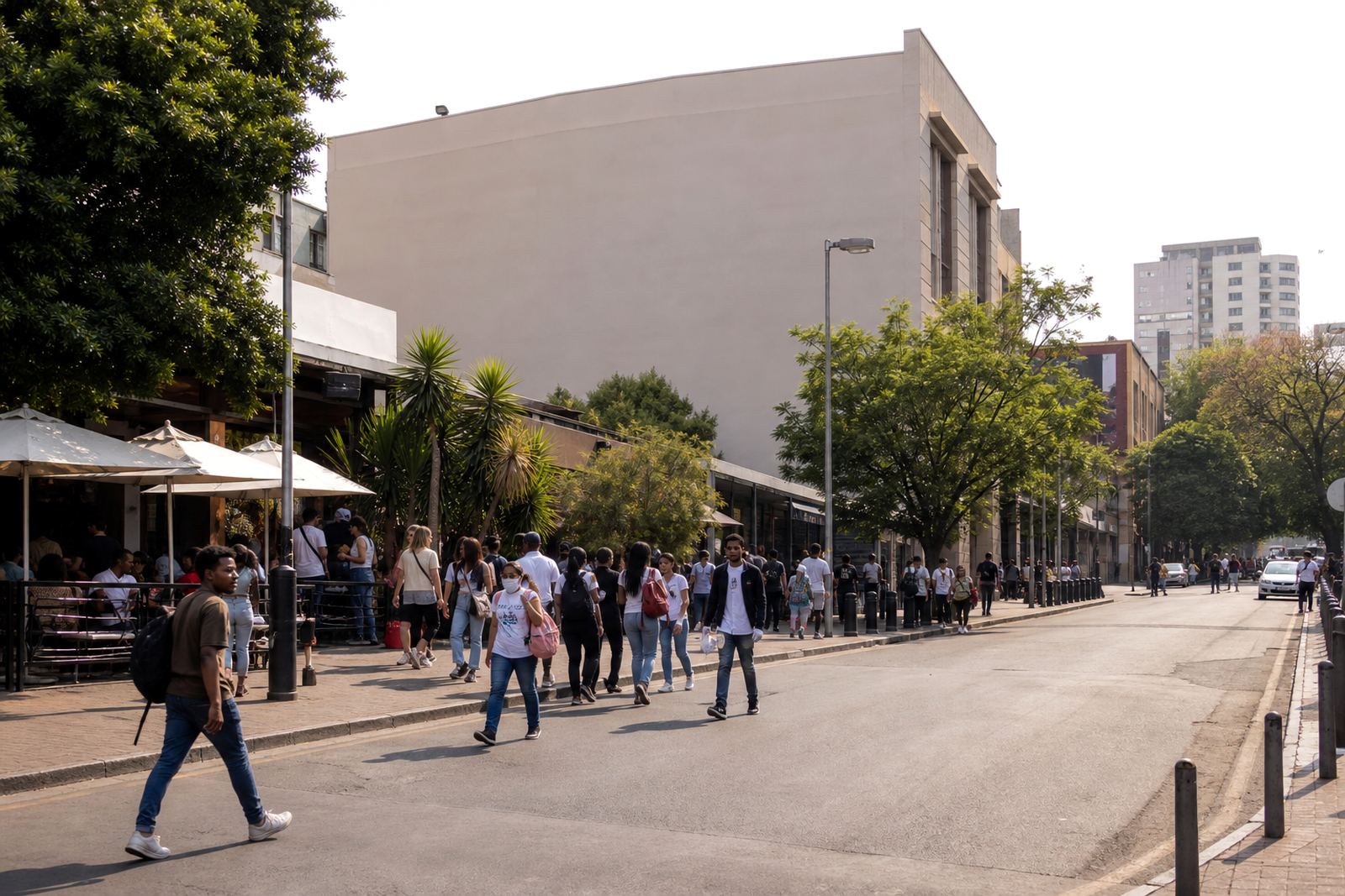
Take two sites in Johannesburg. One is a wall in Braamfontein with steady foot traffic and close-up viewing. The other is a billboard-style space farther out where drivers pass by at speed. Both can be effective, but they do not need the same design.
On the Braamfontein wall, the audience may be near enough to pick up a bit more detail, so the design can include a short line, a clearer call to action and a stronger visual image. On the farther site, the same message would need to be stripped back. The headline would need to do more work, and the supporting copy should be reduced to only what is essential.
This is why site selection and message planning should happen together. The best results come when the viewing distance, the mounting height and the route of travel are all considered before artwork is finalised. It avoids a common problem where a sign looks fine in a file but underperforms on the wall.
- Braamfontein and other inner-city sites often support closer reading.
- Fast roadside locations need larger lettering and fewer words.
- Walls with textured finishes may need bolder shapes and simpler text.
- Consent from the property owner and local municipal bylaw approval must be in place before installation.
What To Check Before You Book The Space
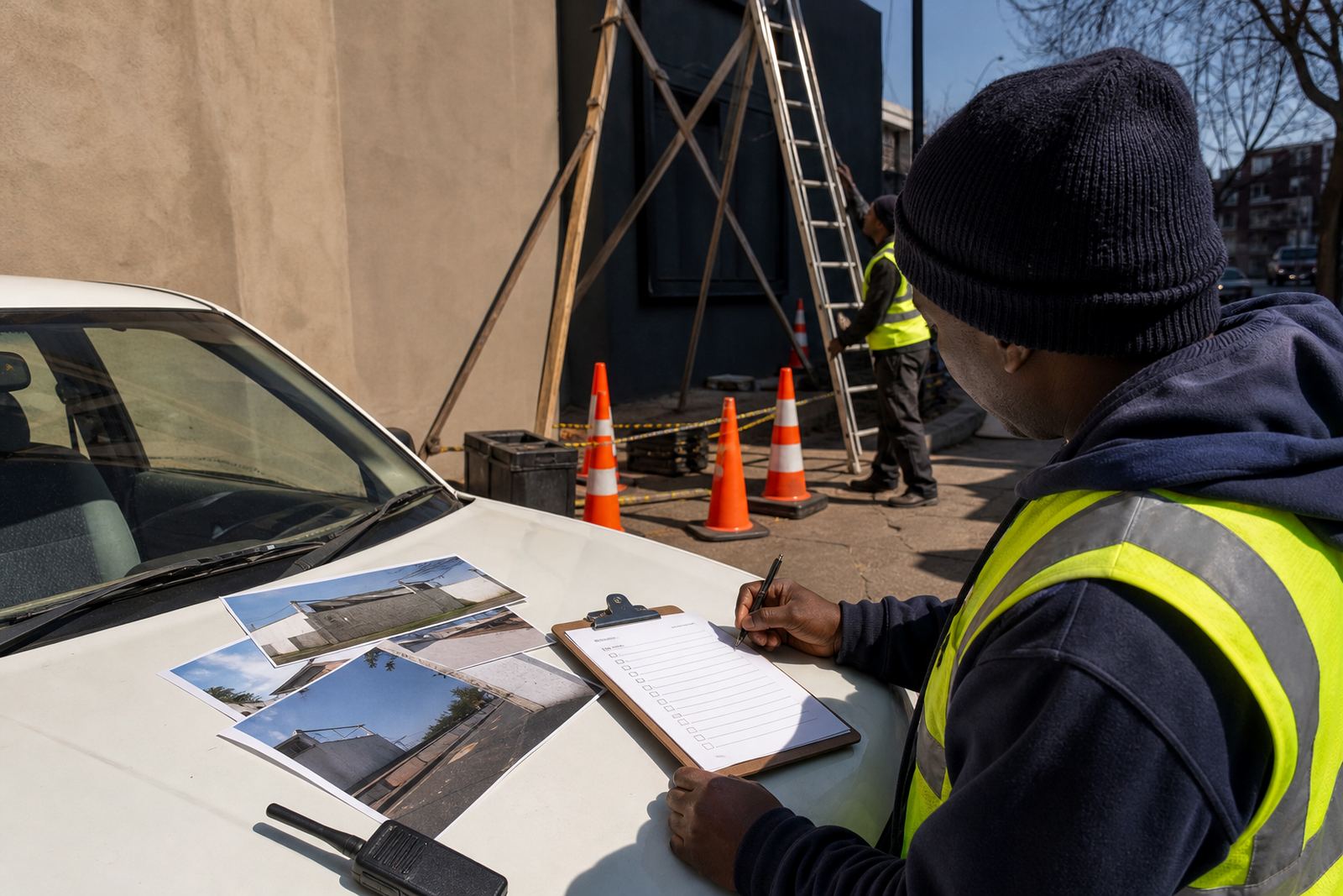
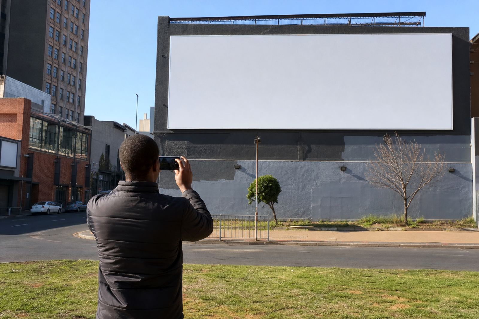
Before any booking is confirmed, check the practical details that shape legibility. The site photo should show the angle, the distance from the road, nearby obstructions and the height of the usable area. A good listing should help you see whether the sign will be read close up or from further away. That is just as important as the size of the space itself.
It is also wise to confirm consent and compliance early. Outdoor signage needs the property owner's consent and the relevant municipal bylaw approval, and some sites have extra conditions depending on location, size and structure. A clean approval process helps prevent delays and reduces the risk of a sign being installed in the wrong format.
Once the distance is understood, the rest becomes more straightforward. The message can be trimmed, the layout can be adjusted, and the installation schedule can be set with fewer surprises. That is how outdoor and wall advertising stays practical. It is not only about getting seen. It is about being read at the right moment, by the right people, from the right distance.